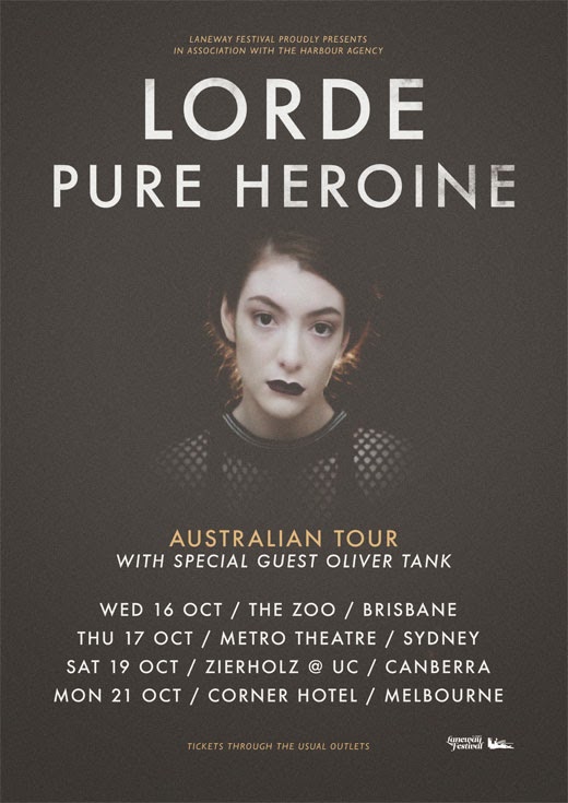
Indie posters:


To help me when it came to creating my own poster I researched existing posters with the same indie/alternative genre that we are using. When researching I found that all the posters follow the same kind of conventions, often using a simple design that just includes straight to the point text and a single image to show the audience what they are selling. By doing this research it has given me inspiration for my own ancillary task so I know exactly what to include and how to design it to fit our chosen genre. I found out what makes a poster visually pleasing to an audience and what will help catch their eye and what kind of information to include. What I also found works best is using a single still shot of either the band or the protagonists in the video larger than the text to show consistency. I will also be sticking to the same colour and font for the text. These are the general conventions I found when doing my research:
- One still shot of artist or protagonist (always a close up)
- Social media information ('follow us on')
- Large, eye catching font with artist and album name
- Star rating reviews from magazines with same target audience
- 'Debut album'
- Consistency/visual link to video
- Font links to genre- stays consistent


No comments:
Post a Comment