Monday 18 December 2017

Stuart Halls Reception Theory

Stuart Hall's theory states that media texts are encoded and decoded y the producer, who encodes messages and values into their texts. These messages and values are then decoded by the audience, but different audiences will decode the media text in lots of different ways and not always in the way that the producer had initially intended. He believes that a text can be decoded in on of three ways:

Dominant or Preferred reading:
The preferred reading is when the text is read in the way that the producer intended, as the audience agree with the ideology that the producer has placed behind the text. This will usually include an easy to follow narrative that is relatable to the audience or are from the same culture.

Negotiated reading:
The negotiated reading is a compromise between the preferred reading and the oppositional reading of the text. This is when the audience accepts the producers messages and values, but also have their own opinions. This could because the audience don't have the same life experiences or don't understand all of the messages being made.

Oppositional reading:
The audience rejects the producers preferred reading of the text and instead create their own meaning which is usually the opposite of the preferred reading. This could be because the text includes controversial themes or the audience have no understanding.

Many factors can be down to the different readings such as:

  • Age
  • Culture 
  • Beliefs 
  • Gender
  • Mood
  • Life experiences 
Reception theory relates to our own work as our audience may all interpret our preferred reading in different ways. Our preferred reading is that the at the start of the video the relationship has ended and the protagonist then goes back to places reminiscing the relationship, however if our audience have never been in a relationship and is a different age then they could interpret it in a completely different way, so it is important to try and make your narrative as clear as possible so people are more likely to read the preferred meaning.


Friday 15 December 2017

Digipak Cover Draft

To help me to create my digipak I will be using an online template that shows me which is the front and back and exactly where each section faces. For my digipak I will be using images from our video that relates to the them and keeping the album black and white changing the levels and brightness so they all have the same contrast and helps it fit with the aesthetic of the music video. To make my digipak I will be using Photoshop to edit each image individually and to then put them altogether using the template.  This is a draft of my didipak cover so far. I used a picture of a pathway that was surrounded by bare trees, with the path covered with leaves as it fits in with our theme of autumn and emphasises the season the video is set in and the idea of 'sweater weather'. Throughout our video we also have a strong theme of nature and keeping things natural which I think links to the image. I have used the same font I have used in my poster to keep them looking similar, and again like my poster I didn't want the cover to be overcrowded so I made the bands initials they use that stands for 'The Neighbourhood' as the main focus so it is straight to the point. I started off by changing the levels to create a stronger contrast so the image wasn't too grey toned and then added a white gradient, giving the image a white wash, over the top so the lettering would stand out. To help blend the NBHD into the background I changed the fonts opacity so that you could see some of the image coming through.


Friday 8 December 2017

Ancillary Advert Draft


This is my draft for the poster ancillary task. I wanted to stick to the theme of black and white so it matches the music videos theme and is recognisable with the video. We did a photoshoot of our main protagonist and made sure they were wearing the exact same outfit and hair as they are in the video, so again it links and doesn't look completely different. We used a black screen for the background so that the image didn't require too much editing and means that I didn't have to cut out the protagonist from the background, making the outline obvious that she has been cut and pasted onto a black background which make the poster flow better. I used side lighting so that it is perfectly aimed and lights up the protagonists face, making this the main focus point as she stands out from the background. I wanted to follow some of the conventions of other music posters that included star ratings that stand out to the audience and makes you want to buy the album. I researched the album the song was actually from and which is where I found the magazines that had reviewed the album to keep it realistic. By doing this it also meant that we were including reviews from magazines our target audience would read and find out about the album. I kept the poster to the point as I didn't want it to be overcrowded by including the band, song and album name, ratings and social media platforms to help promote the song. I received the following feedback:
  • Like the black and white
  • Like the fact model isn't facing camera
  • Maybe use different fonts
  • Writing is too bunched together
  • Need something in bottom corner (release date)
  • Ratings higher up 


Thursday 7 December 2017

Research & Analysis on Existing Digipaks

Before starting my own digipak I researched existing media products so I was able to see what information to include as well as the typical codes and conventions you would expect to find. 

The first digipak I have decide to look at is Lana Del Rey's from her album 'Born To Die' as the genre is Indie like ours. For the front cover a medium close-up of Lana Del Rey herself has been used, focusing on her face and outfit. This allows the audience to get a clear representation of the artist, which is a common feature used in the indie genre as they are trying to sell the artist to their audience. She is known for her vintage style, giving her an easily recognisable visual style and this is further represented through her outfit, hair and make-up. Because the photo has been shot outside it links to the indie genre as they are usually shot on a low budget outdoors. To keep with her easily recognisable visual style, Lana Del Rey has used a simple, vintage font that she used throughout all her albums so it is recognisable to her target audience. To further add to the vintage look, a filter has been used to soften the photo so they aren't as bold, giving the digipak a fresh and calming look. On the back the same simplistic font has been used for the track list, giving the digipak continuity. Other conventions that you expect to find have also been used such as the record label, barcode and copyright information. Unlike the front cover, a bolder red and white has been used which could be to reflect the emotion of the album and it's songs in a simplistic way.


On the inside of the album another similar styles photo has been used. By using a close-up shot this time it allows the audience to focus on her body language, as the image used is a serious facial expression that could represent how seriously she takes her music. She is pictured in the same setting with the same filter, which shows Lana Del Rey in a very natural way as it is very minimalist compared to the usual over glamours images usually used, which is similar to how we are trying to portray our own protagonist. For the CD she has kept to the minimalist style, with a white background and three red roses, making the roses stand out against the background. The use of the roses could signify love, which could be a common theme within the album. 


The next album that I have looked at is Arctic Monkeys 'Favourite Worst Nightmare', as again they have the same indie/alternative genre. The colour scheme used throughout the digipak is a mix of light and dark colours, with the main colours being yellow and grey. The colours used do not clash with each other, with the yellow standing out from the background. In contrast to the front and back covers, the inside of the digipak is colourful with the main theme being graffiti. This could suggest that their main target audience is teenagers or young males. In an interview with NME, the lead singer if the band Alex Turner said that the albums artwork was intended to portray a particular atmosphere, 

Image result for arctic monkeys favourite worst nightmare digipak analysis
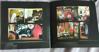
“We wanted to do something physical, like do something real with the artwork...The idea was to get a house or a factory that looks really plain and bland, dark satanic mills or whatever, and then inside there’s all this colour." This is because when you first look at the album you get the idea that the album has a very dark tone, which is then contrasted with the bright colours used inside which represents the mix of songs within the album. On the back cover the dark colour scheme continues, with a different text used but still in the yellow colour to stand out against the background. The only information used on the back is the albums track list in a very small font at the bottom, and copy right information which keeps the focus on the artwork.


Wednesday 6 December 2017

Research on Existing Adverts

Indie posters:

Related image


To help me when it came to creating my own poster I researched existing posters with the same indie/alternative genre that we are using. When researching I found that all the posters follow the same kind of conventions, often using a simple design that just includes straight to the point text and a single image to show the audience what they are selling. By doing this research it has given me inspiration for my own ancillary task so I know exactly what to include and how to design it to fit our chosen genre. I found out what makes a poster visually pleasing to an audience and what will help catch their eye and what kind of information to include. What I also found works best is using a single still shot of either the band or the protagonists in the video larger than the text to show consistency. I will also be sticking to the same colour and font for the text. These are the general conventions I found when doing my research:
  • One still shot of artist or protagonist (always a close up)
  • Social media information ('follow us on')
  • Large, eye catching font with artist and album name
  • Star rating reviews from magazines with same target audience
  • 'Debut album'
  • Consistency/visual link to video
  • Font links to genre- stays consistent


Friday 1 December 2017

Photos of Filming

As I am in charge of filming and camera work for or music video, I wanted to post some images of me filming one of our shots in Sidmouth.


Final Post

As it is coming to the end of the media course, it is now that I have appreciated just how much I have learnt and how much my skills have im...