In order to get instant feedback of what our target audience thought about our music video we used social media such as Twitter and Facebook messenger. Our audience enjoyed our video and engaged with the narrative with majority of our feedback being very positive, however some of the improvements that we received was that the contrast with the black and white isn't consistent throughout and needs adjusting slightly. They also said that some of the clips are still lag slightly however this is due to the lack of quality after uploading it to YouTube.
In today's lesson we decided to add in the titles at the start of the music video as we had finally edited the first clips and were happy with how they looked. In order to pick the right font we experimented with layouts and fonts so we were able to see what worked and what didn't, as well as asking people in our class what they thought, as they all fit into our target audience of male and female teenagers.
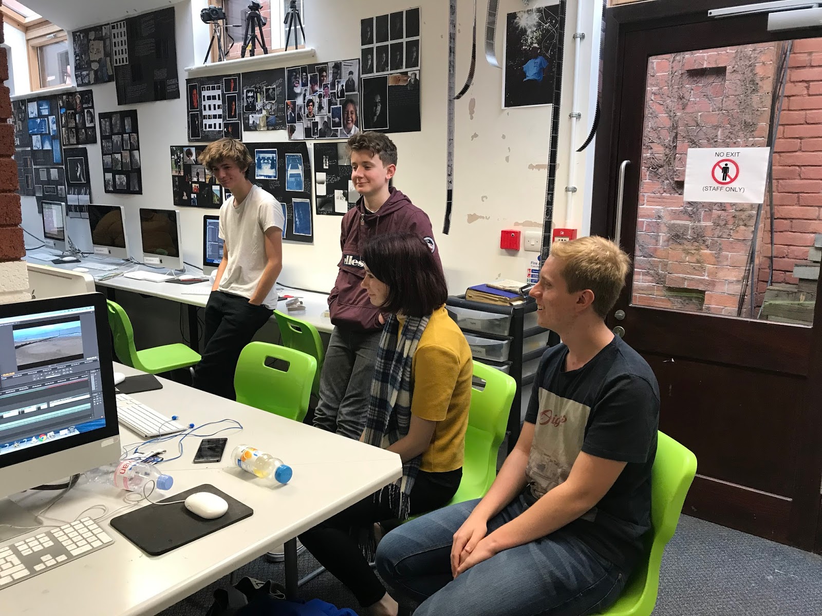
Some more photos of the editing process:
After getting feedback from our audience on our font title they all agreed that the font didn't fit with the indie/alternative genre so we have decided to use this one:
This is my digipak so far, since last time I have decided to change my back cover to a photo of the protagonist as I think this works better than the trees as it shows her importance throughout the video. I have used the same photo as my poster so that there is continuity throughout my products and makes it easily recognisable and I have kept the same layout that I had originally used. I have also changed the inside as originally I had used one picture of the clouds, however I wanted to keep it the same so that it flowed better. I did this by splitting the image of the clouds into three sections so that they all fitted together. On the bottom left corner I have added a photo from the abandoned warehouse as I think it represents the mood of the song and the emptiness the protagonist is feeling throughout the video and it also means that it keeps a link to the video and the footage used.
In todays lesson we got our media class to watch our video so far as we are very close to finishing, so wanted feedback on how we could improve what we have so far in order to create a higher quality product. They all agreed that the continuity of the black and white is aesthetically pleasing and links in well with our indie/alternative genre as well as the flow of the shots as they are all in order and the locations transition well.
Video of some of the feedback:
However, when shown to our audience and as highlighted below they agreed that it doesn't make sense that it switches from the protagonist wearing a coat to not and then back again, but we adapted our idea and thought it would make more sense to have the video showing a passing of time of her reminiscing rather than it being set in one day. As well as this they said that some of the clips lag a little.
Since we started the initial planning of our video our ideas have changed a lot. I feel like our initial ideas were very cliche and we thought that this was the best way to get our narrative across, however we have moved away from this as our video has developed as we wanted our video to be relatable to our audience and we felt that by making it stereotypical and over the top wasn't the best way to do this as it isn't what happens in real life. We have focused a lot on our video being natural and emphasising this through the settings and the way we have represented our protagonist. We have used the same locations we had initially chosen such as the beach, the woods, Ottery St Mary and the abandoned warehouse but the shots have changed quite a bit since creating our storyboard and animatic. Our narrative is still based on a break-up, but when doing our pitch our audience said our initial ideas weren't clear enough so this is something we have also worked on. I think our developed ideas work well and flow a lot better than our initial ideas would have and that we were too ambitious at the start, as we want to make a product that appeals to our audience. When creating our animatic we also highlighted that close-up shots are a common convention of music videos and that we were going to include. However, we decided not to use any as we are representing women as one and she is more of a symbol rather than an object.
This is a draft of our music video so far. We have edited most of our footage now, however there is still one last location to film which is the woods. We have also started to reverse some of the shots when the music starts to change towards the end which I think is really effective and reflects back on the rest of the video, but we are still yet to overlay some of the footage as we need the wood shots first otherwise the footage would start to become repetitive.
Audience Feedback of our work so far
Positives:
Like the idea of reversing and overlaying shots a it works well with the music
Like the footage we have gathered from the abandoned warehouse- very aesthetic
Sun set shots are good and emphasises time of day
Car shots are good transitions
Improvements:
Making sure that the contrast is similar throughout to keep continuity
Try and use shots that haven't yet been used to overlay with the others otherwise it's be repetitive
Maybe add another clip at end to make ending clearer
This is my digipak so far. I have used a picture from the forest looking up so it links in with the theme of autumn and my front cover. I then added a white gradient and gradually changed the opacity so that it gets lighter and lighter, similar to what I did with my front cover. This meant that I was then able to add the text and it would be easy to read, without there being too much contrast. I have included the clouds as i wanted to see how it looked, as I am thinking about using a series of three images so it all links together.I then got audiences feedback for my work so far.
The image used for the back cover is not my own and found off the internet, I am using it for draft purposes only to see how the idea works.
Front Cover:
Like the opacity
Maybe add a shadow behind letter to make them bolder
Like the minimalistic design- links to genre
Like the black and white theme throughout- all links together
Back Cover:
Change the gradient- add a bit more so you can see the end of the words
Fit the sentence onto one row
Change opacity of letters so it blends in better
By getting audience feedback it ensures that my products are the best they can be and are aimed at my target audience by taking on board their feedback.
On Thursday 8th of February, we are hoping to go and film at an abandoned warehouse in Exmouth. We are aiming to film at around 1-3pm, but because the roof has collapsed it is all open air, so in order to film we will need to film it on a dry, bright day in order to keep the shots similar throughout the video.
As you can see the weather should be dry so if the weather stays like this then we will be able to film and get some good shots throughout the warehouse and of the light peering in, which will also help when the clips are black and white as we should be able to get a good contrast.
This is a risk assessment for the abandoned warehouse. After checking the location out before filming it is safe to film in and as long as we warn our actors about the surroundings and everybody is aware then there aren't any high risks.


 By getting audience feedback it ensures that my products are the best they can be and are aimed at my target audience by taking on board their feedback.


